THE COVER
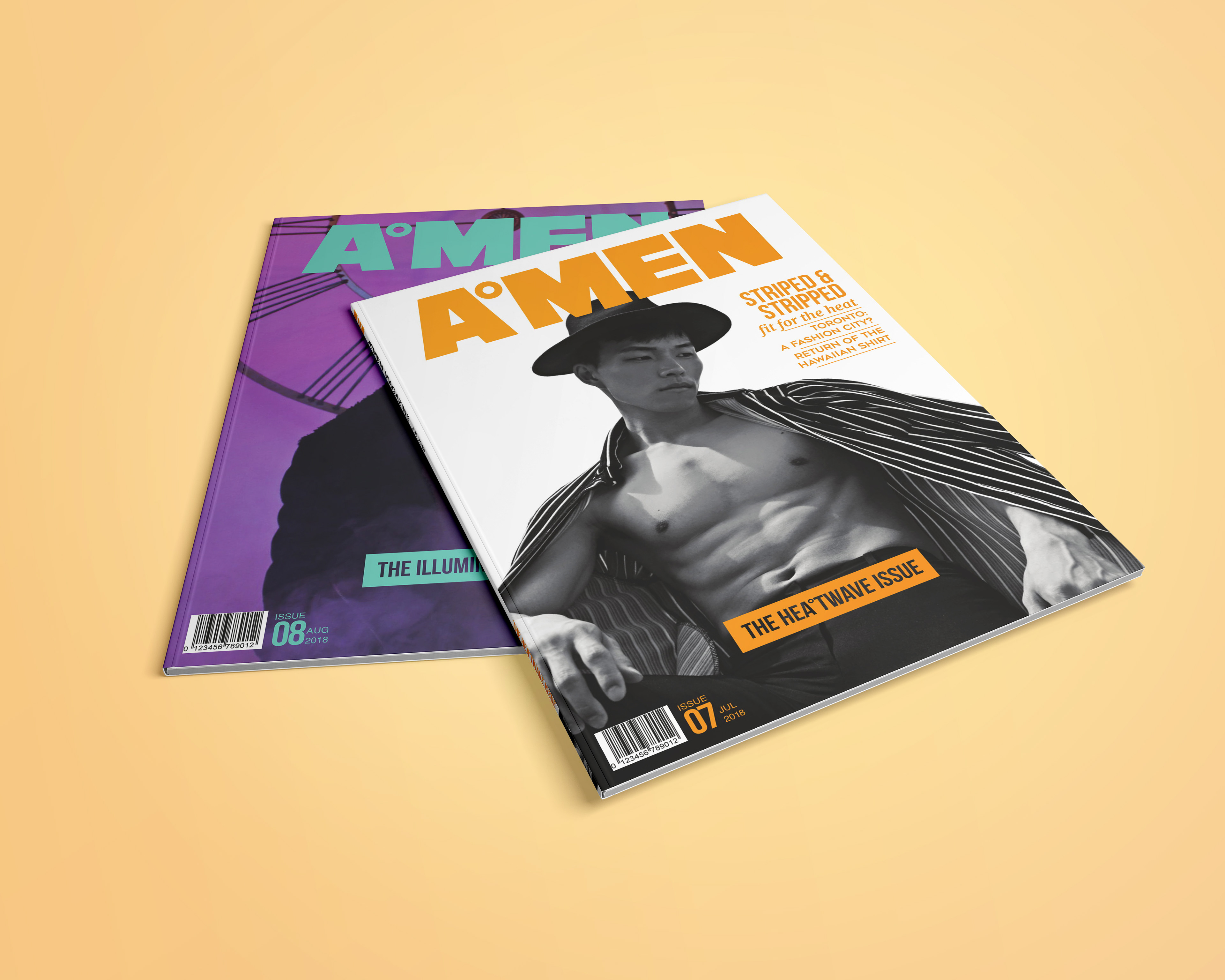

COLOUR AND TYPOGRAPHY
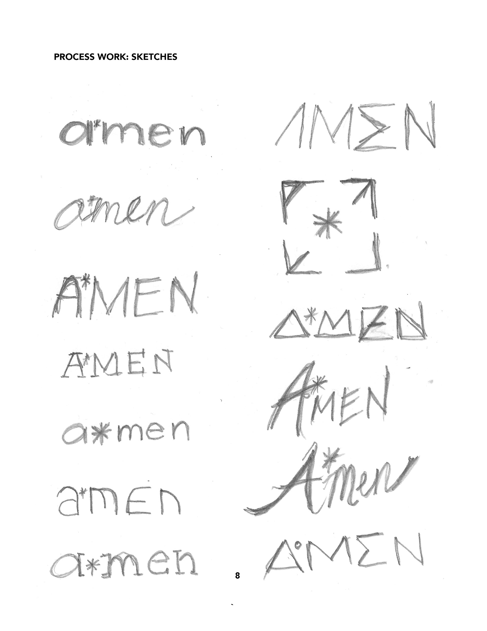
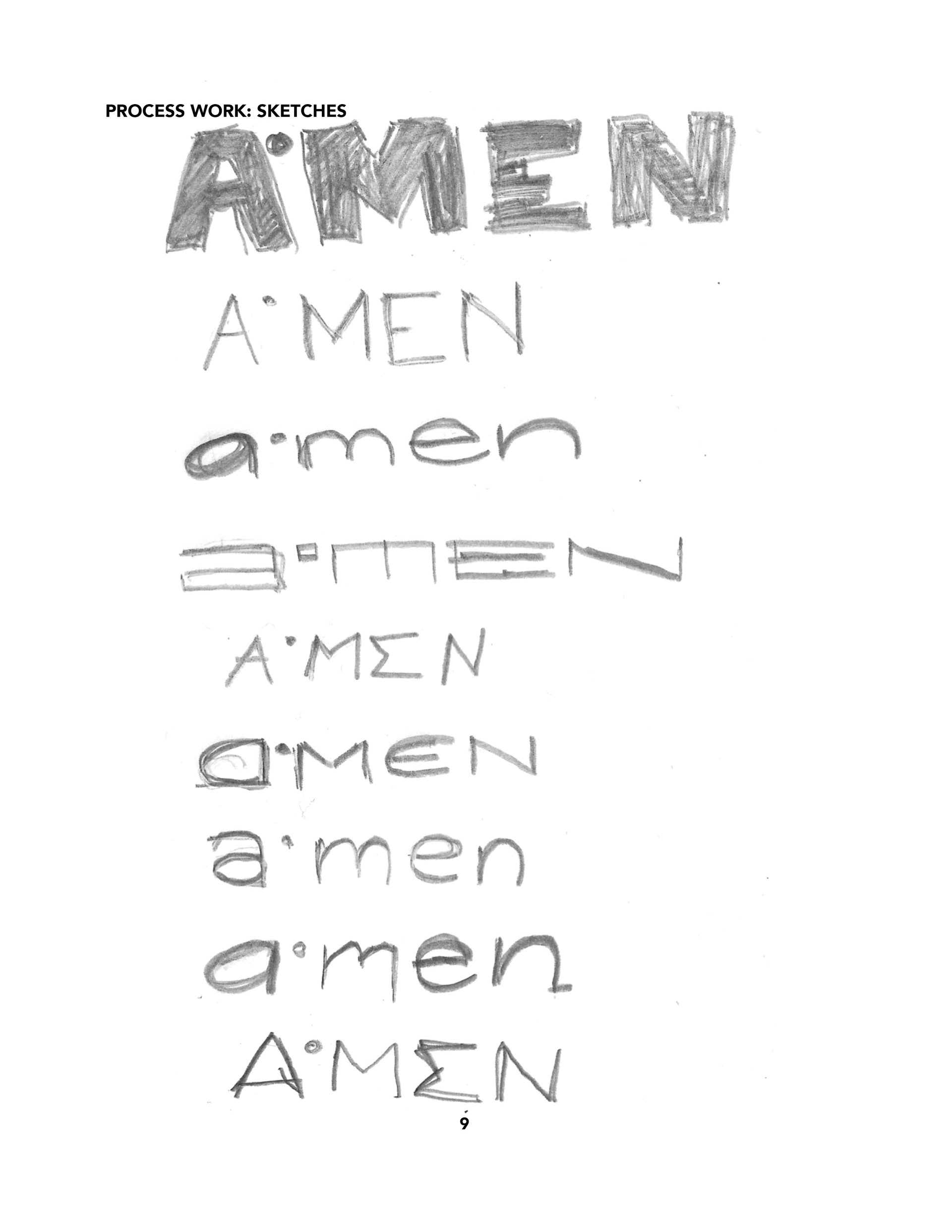
WORDMARK AND BRANDING
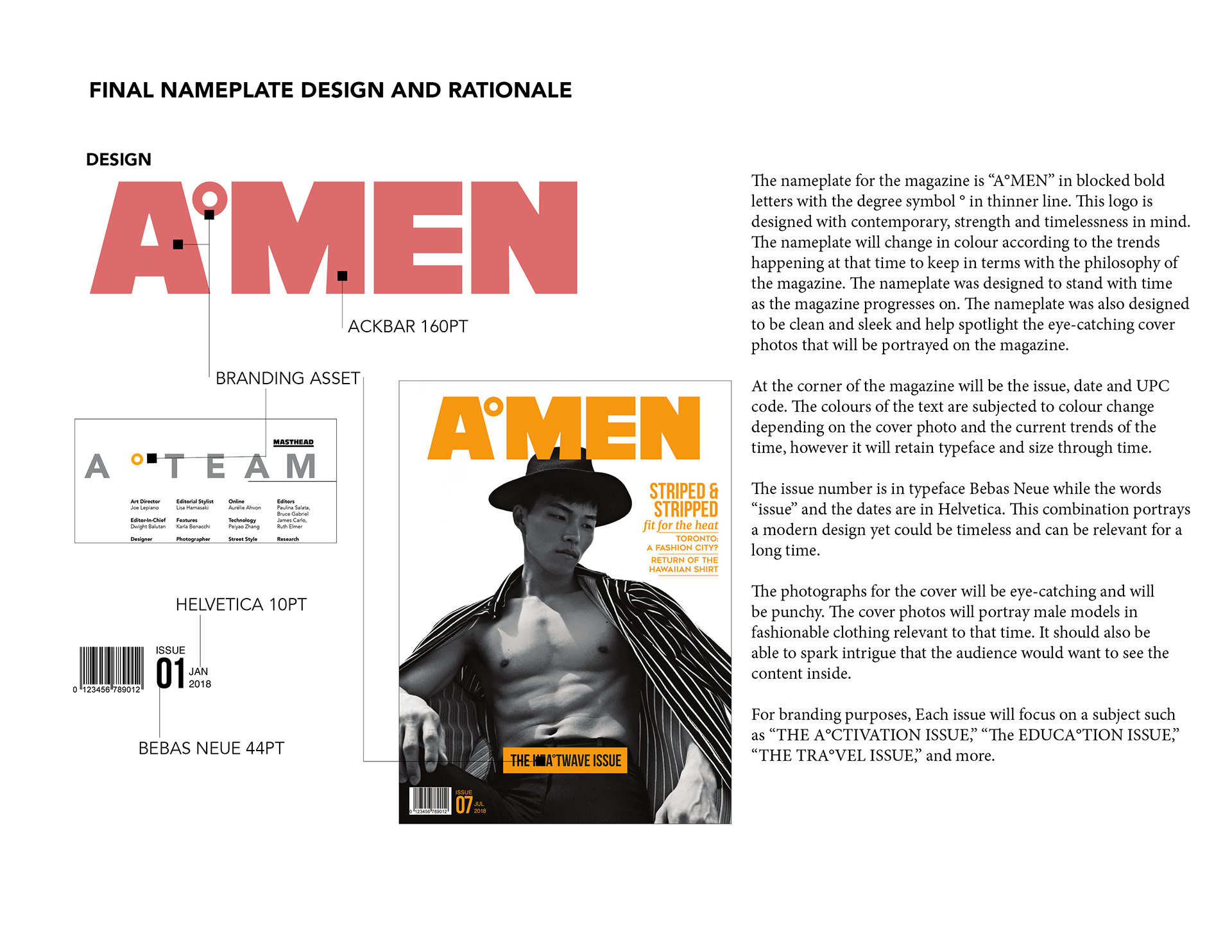
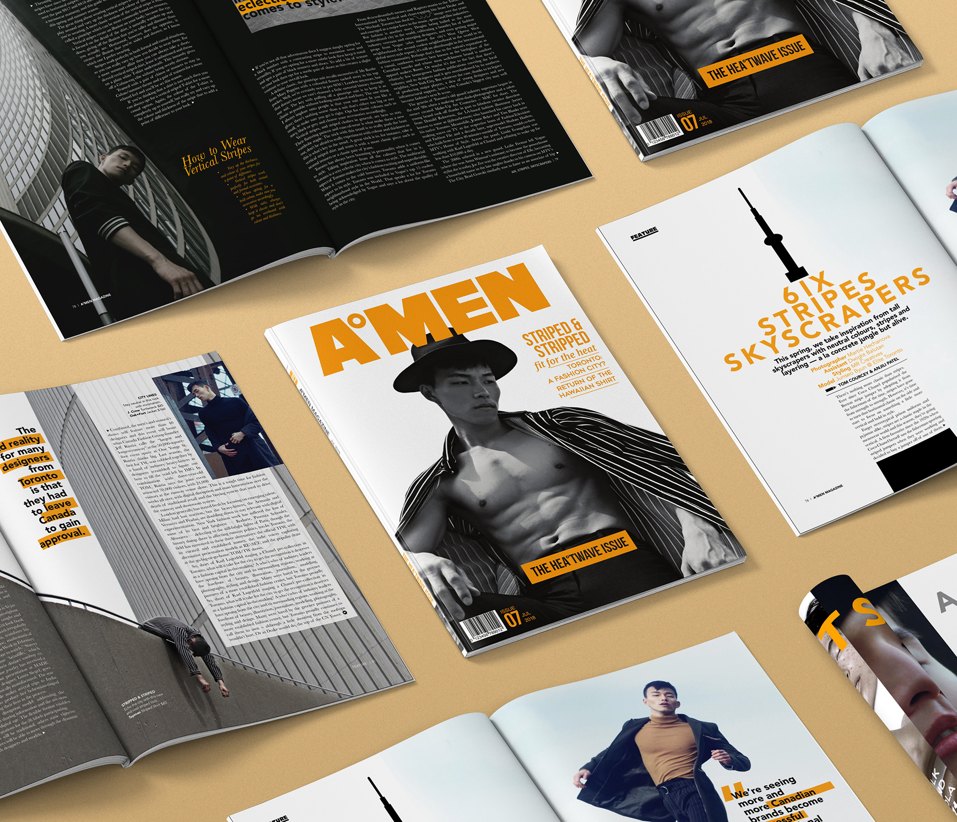
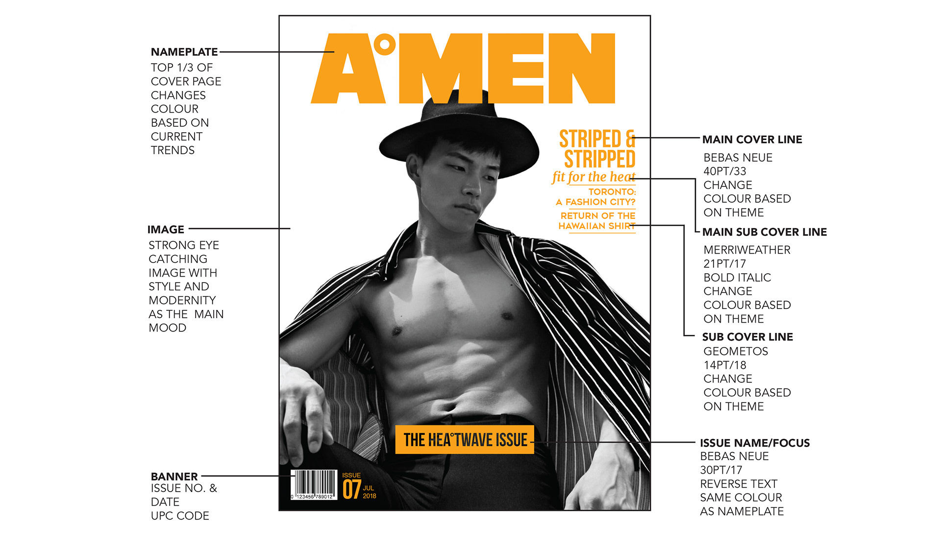
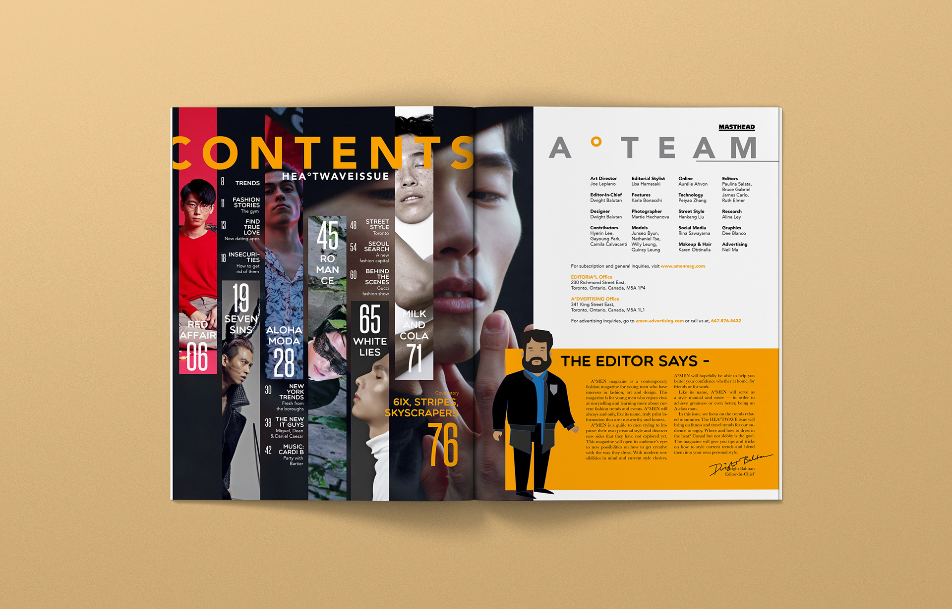
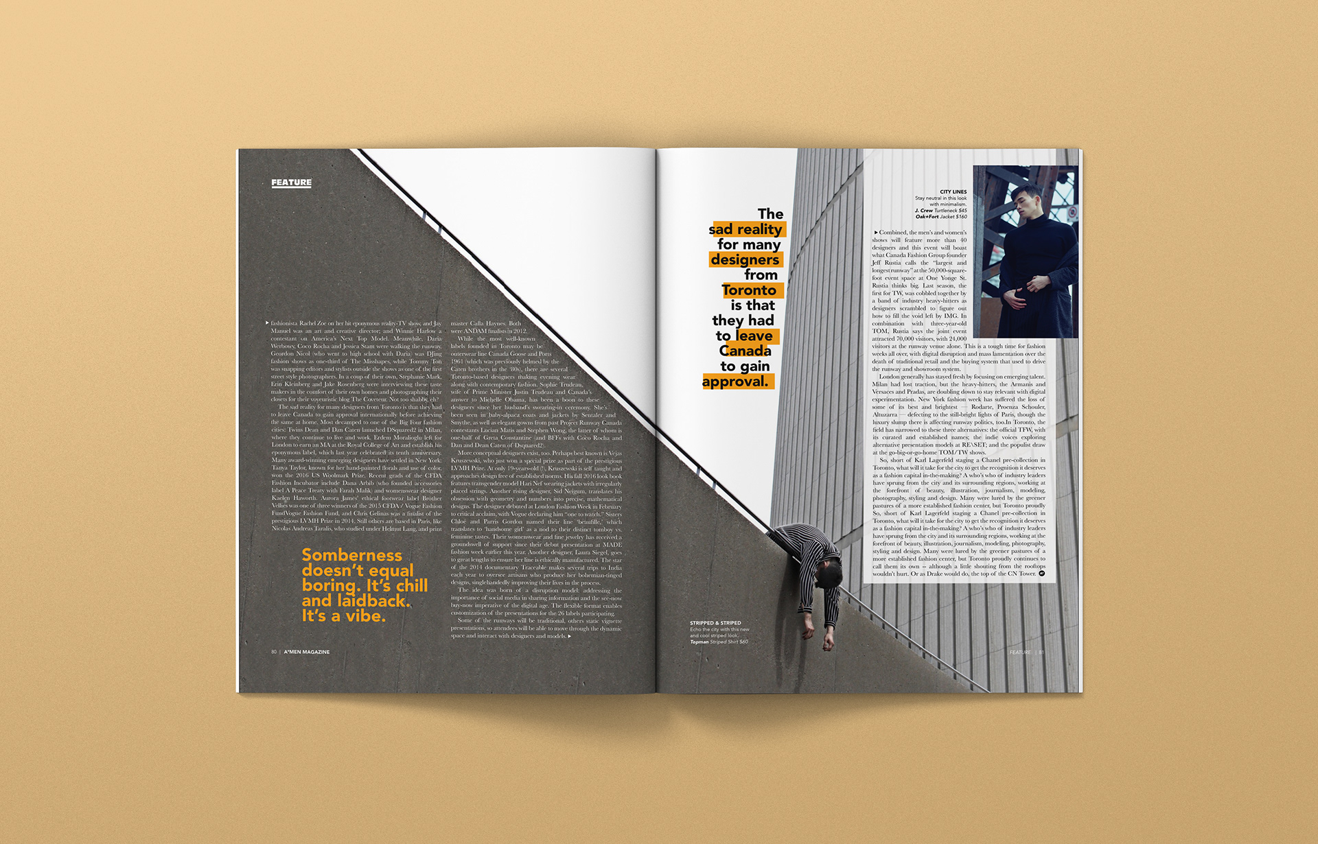
For this magazine, I wanted to focus on a contemporary aesthetic and at the same time, creative. The nameplate on the magazine was designed to portray strength and masculinity but also with some flair portrayed by a degree symbol that is hollow. The typography was kept very minimal and clean yet impactful. The best example is the titling of the cover story "6ix Stripes Skyscrapers," where the title is formed to look like the CN Tower while the imagery of the jumping model is on the next page to give the story a sense of whimsy and wit.
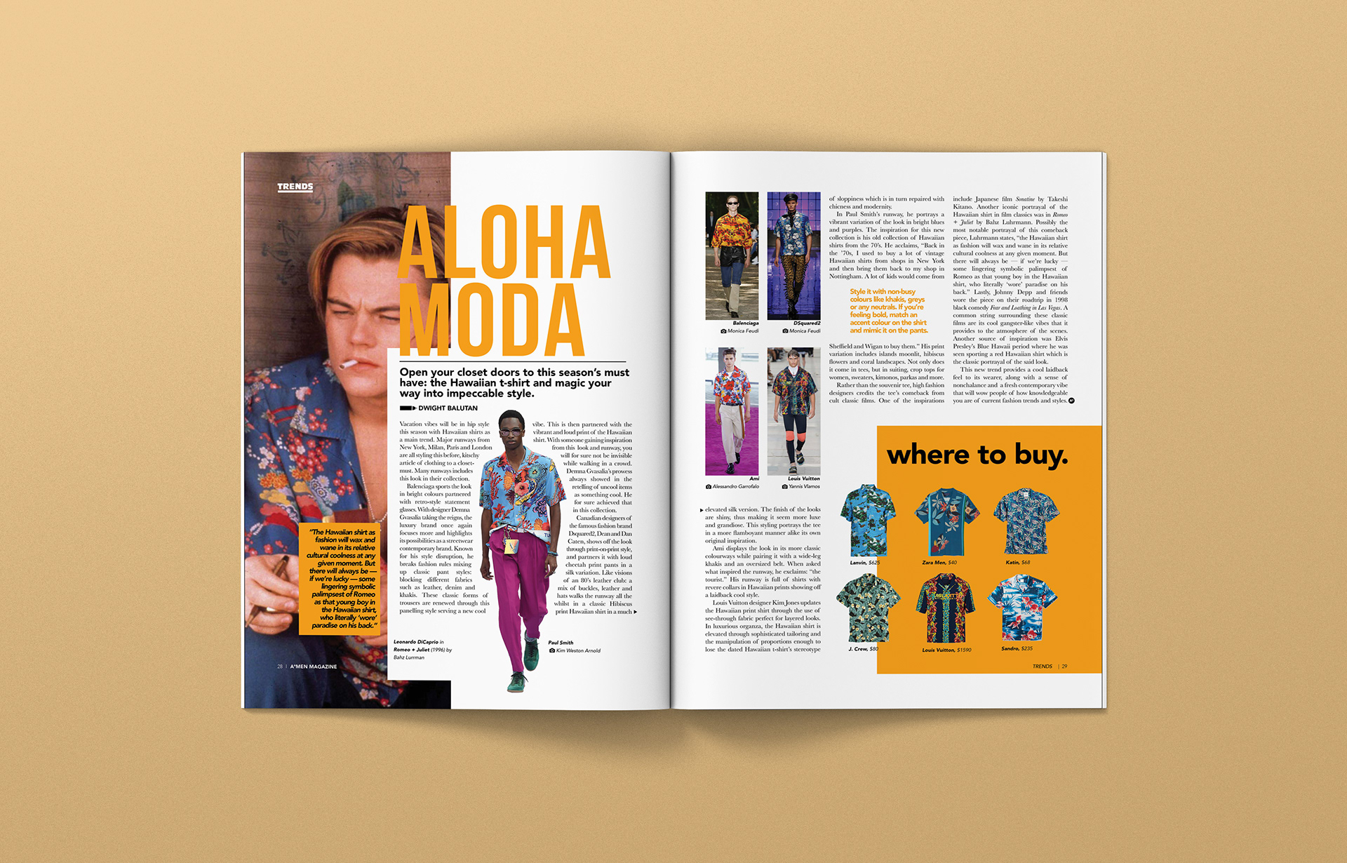
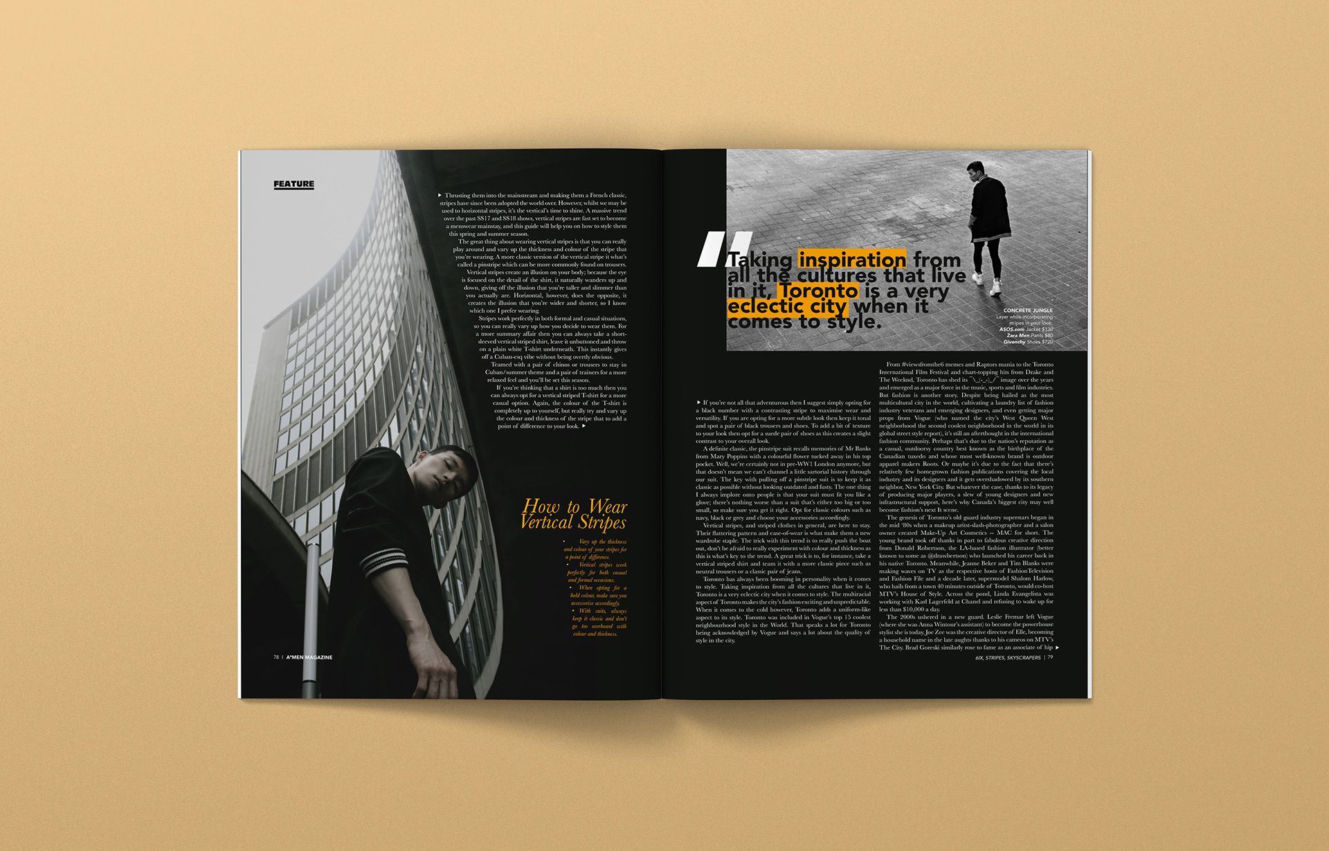
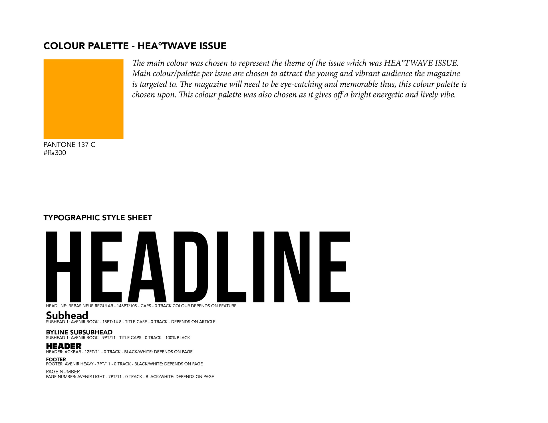
The body text was designed to synergize with the images to show better composition and layouts. The colour palette chosen for this issue was orange to complement the main theme of the issue which is the "THE HEA°TWAVE ISSUE." The callout typography was designed to stand out but also go along with the minimalistic and contemporary vibe of the whole magazine. Overall, the typography of the magazine was impactful and helped the story-telling of the editorial which is what I believe great typography is.
The body text was designed to synergize with the images to show better composition and layouts. The colour palette chosen for this issue was orange to complement the main theme of the issue which is the "THE HEA°TWAVE ISSUE." The callout typography was designed to stand out but also go along with the minimalistic and contemporary vibe of the whole magazine. Overall, the typography of the magazine was impactful and helped the story-telling of the editorial which is what I believe great typography is.
PROCESS