

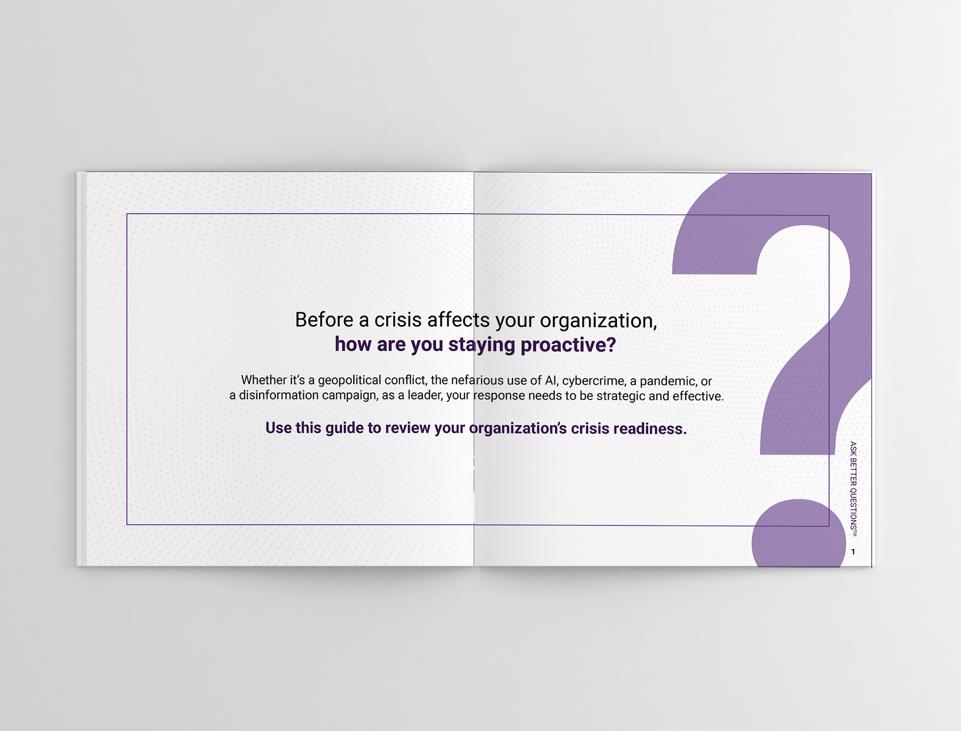
Proof Strategies wanted to highlight its capabilities of being able to detect, protect, and correct crises—through a new landing page, a guide book and some digital ads, the Agency wanted to spread more awareness to this.
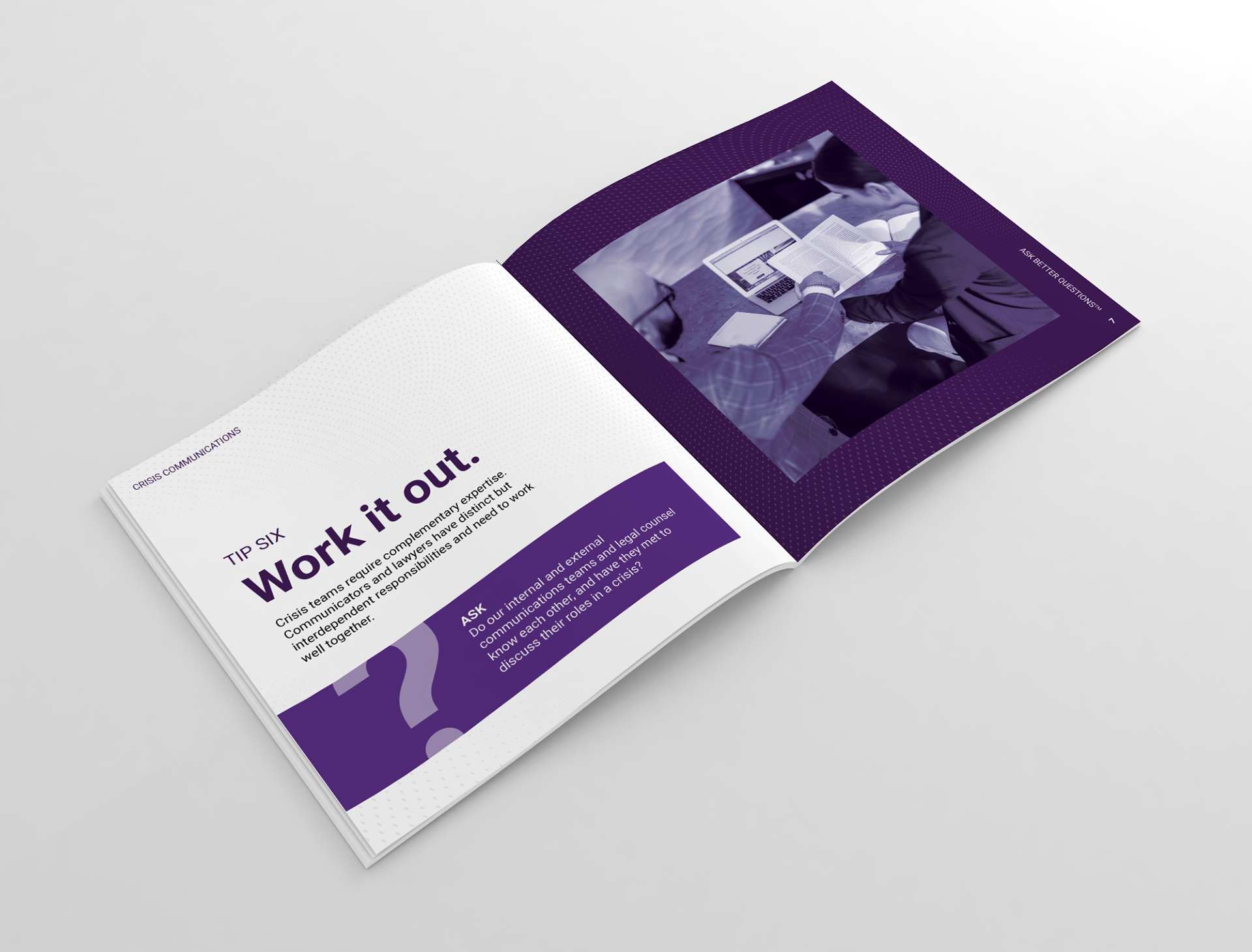
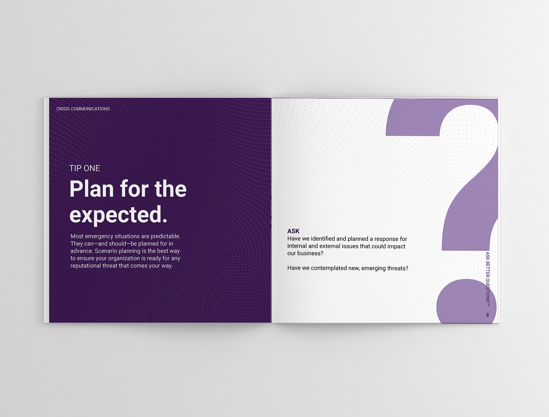
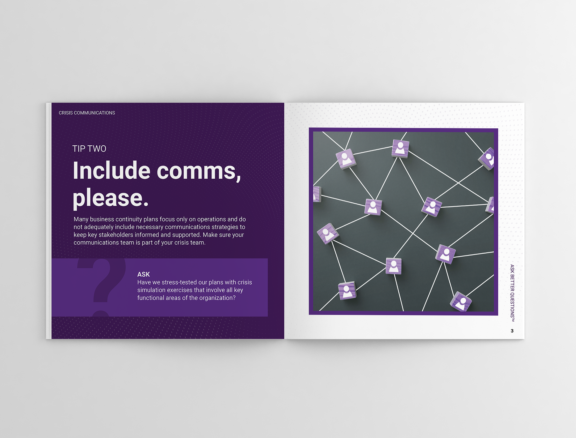
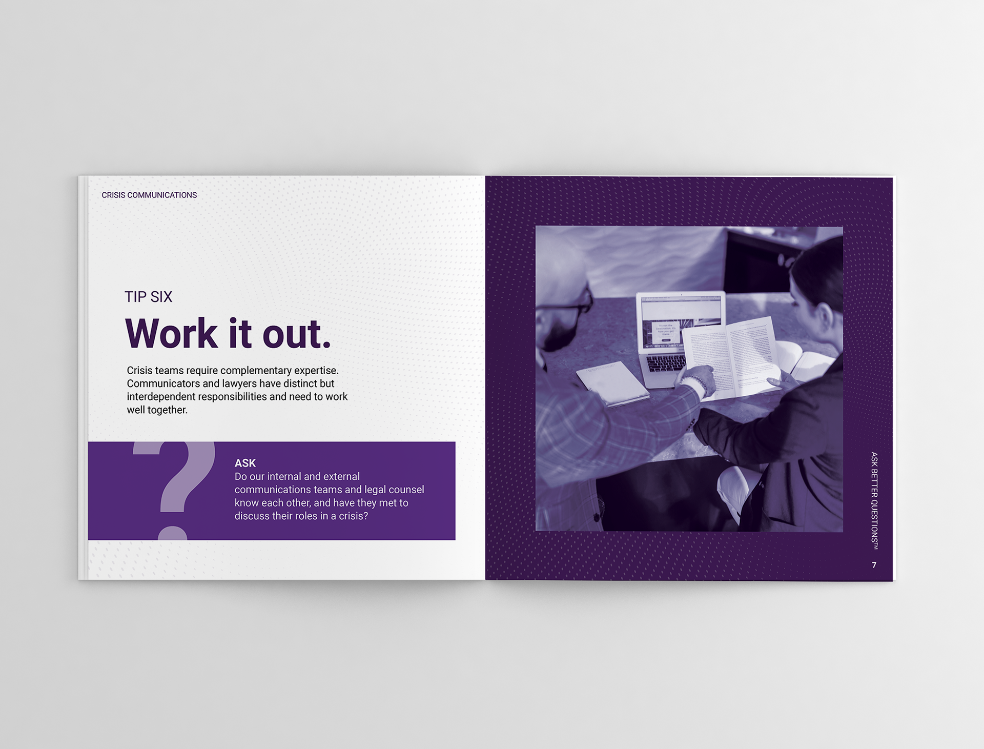
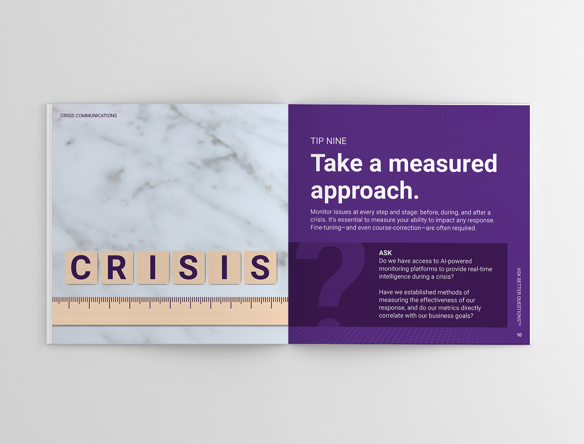
My design approach was to heavily take inspiration from Proof's already strong identity with its primary brand colour purple and pushing it into a more monochromatic route—sleek and modern feeling. I was also inspired with the idea of using duotone circles as an accent to add texture to the pages. For the imagery, I went a more abstract way that's also tongue-and-cheek for some lightheartedness, again pushing forth monochrome usually photo editing the colour out and changing it to only purple. View the full guide book via the Proof Crisis Communications landing page.


Agency: Proof Strategies
Client: Proof Strategies
Designer: Me
Oversight: Adam Zarudny
Copywriter: Lina Vitkauskas